becher street circa 1998

A view out a window with plants trailing from a shelf on the right, two cats on the sill on the left, and a row of trees in the background.

While searching through old blog photos looking for something else, I came across this scan of a photo that is still tucked in the corner of my corkboard in the sewing room. It’s my sweet kitties Benny Bibsley and The Fuzzy Pickle back when we lived in the top of a 1.5 storey house on Becher Street in London, Ontario. There wasn’t a screen in this window and I would open it to let Benny and Pickle outside where they would run up and down the roof. This was also the closest thing I had to a porch in this apartment, and I would sit on the sill with my legs stretched out on the roof and drink tequila and orange juice. The back 40 stretched all the way back to a wooded slope that led down to a floodplain full of soccer pitches and beyond them, the river. We moved out of here when the trees were starting to be cut down for a new lane of houses to be built parallel to our street.

the kitchenening, part eight

We have upper cabinets. Behold our glorious gold. It’s not quite that 70s Harvest Gold, but definitely references it. This whole space will be very 1970s-adjacent once our near-avocado backsplash is in. Here’s a tour of the progress moving clockwise from the doorway (the doorway to the current kitchen, as the one to the new dining room is still blocked off with plywood).

gold and brown kitchen cabinets partially installed in a white room with a window through the wall and oak flooring.

This is the enclosure for the fridge. The left side will be filled in to push the fridge out from the wall a bit. That cabinet up top is enormous and has tray dividers on one side.

yellow and brown kitchen cabinets partially installed in a white room with a window through the wall.

You can see on the upper right there how warped our original plaster walls are. All of these cabinets will have trim on the top that extends them to the ceiling. I don’t mind the look of a gap there but it’s sure going to be nice not to have to clean it.

The hole in the wall will have tile extending up the sides from the backsplash, and a quartz sill.

yellow and brown kitchen cabinets partially installed in a white room with a 100 year old window.

Now we can really get a sense of how sort of weird the original trim on the window will look with the lighter colour of the wood cabinets. Our designer, Markie Tuckett of Timber + Plumb (link: Timber + Plumb) would have preferred to refinish the old trim to match, which probably would have looked beautiful, but I want to keep it the same as the other rooms and insisted it go down as one of those “client quirks”. Ditto for the totally trashed original oak floor, which we may still refinish some day, but not today.

yellow and brown kitchen cabinets partially installed in a white room.

There’s our beautiful open shelf with the gold cabinet and birch shelves and back. This is where my antique Crown jars full of spices will go. Being able to mix my spices right next to the stove feels like the height of luxury.

a tall yellow pantry against a white wall on which a stack of large sheets of wood is leaning.

Opposite that is our very tall pantry, with roll-out drawers in the bottom section. The narrow top part looks a little strange, and we lost a good deal of capacity to make room for the open shelving on the side that I insisted on, but the whole thing is so deep there’s still at least six times the space we had in our old pantry. And our Japanese stacking coffee mugs from the 1960s are going to look so good on these open shelves.

blue sketchbook 2012

Years and years ago this website had hundreds of pages of portfolio and sketchbook images and that’s all here somewhere, hidden in a secret folder I may never open. I’d still like to share that stuff somewhere, especially the sketchbooks as I keep dipping into them and recycling images and ideas into new work. I can’t handle dealing with all those old html pages so I’m just going to start sharing them here.

This big blue sketchbook dates from 2012 into 2013, at a time when I had a studio in an old house in downtown Windsor above a lovely restaurant called Rino’s Kitchen (RIP), was taking Spanish classes for fun at the university, working a few sessions at the bingo hall every month as a charity volunteer on behalf of Artcite, Inc (link: Artcite), and was embarking on my very fun but short-lived stint in roller derby.

It’s a standard 8.5×11″ black hardback sketchbook, but I took off the cover and replaced it with a sturdier one, covered with some old woodcut prints with leather spine and corners.

Here’s the front cover:

00frontcover

And the drawing on the front endpaper and flyleaf:

00frontendpaper

(whoops, I glued that endpaper down with a bit of a crinkle in it. This is why we don’t exhibit our sketchbooks!)

And here’s the first page, which I remember drawing while sitting under the front gate canopy at House Redhair, our camp at the Pennsic War (link: Pennsic War). This would have been Pennsic 42, summer of 2012. I don’t actually like drawing with pencils in my sketchbook and the back of that flyleaf there is why. The rest of this book is drawn with things that don’t smear: ballpoint pen (Zebra F-301 7mm, my favourite), markers, bingo dabbers, and lots and lots of white gel pen (yes I buy those in bulk). Although I started with the first page, the rest of the book was drawn all out of order, and a few pages are used bingo card sheets I drew on and tipped into the book later.

page01

the things i do for money

A white woman's forearm wearing a stack of hair scrunchies in blue, bronze, and orange tones, in front of a blue backdrop.

I delivered this witchy, moody collection of luxurious silk scrunchies to asil yesterday (link: asil gallery and studio). They’re hand printed with some of my lino blocks, and dyed with indigo, coreopsis, avocado pits, comfrey, and iron. I’ve been using them to wrap up my bedtime topknot and the silk is so gentle on my hellaciously unruly curls and I feel like an old-timey movie star going to bed wearing such elegant accessories even though I’m usually also wearing a stretched-out tank top with ceiling paint on it.

Silk hair scrunchies in blue, bronze, and orange tones, on a blue backdrop.

the kitchenening, part seven

kit7a

Behold, our cabinets! It’s a good thing we also emptied out our living room as part of this job, because there wasn’t going to be anywhere else to store these.

I skipped over the part where the drywall got finished and primed, because I couldn’t stand to take so many lifeless white-on-white photos. The ceiling in the living room above was replaced as part of this job, and the wall whose doorway got closed off was totally redone, and our contractors went above and beyond by also filling the major cracks in the rest of the original plaster and primed the entire room! No more of that joy killing beige that we haven’t changed in the 20 years since we bought that house. It’s well beyond time this room got painted in a colour we’ve chosen ourselves.

And here are the lower cabinets installed, all ready for templating the countertops.

A room under construction with wood toned kitchen counters partially installed against a white wall containing a window that looks into a darkened adjoining room.

The space where there’s no drawer is where the microwave oven will live, with its own electrical outlet. Next to that, where the cabinets seem a bit lower, is the slot that will house a nice big pull-out butcher block that we’re going to commission a friend’s woodworker son to make for us.

kit7c

And here’s the sink cabinet and the beside-the-stove cabinet, where for the first time since we moved to Windsor 22 years ago we’re going to have a junk drawer! Friends, I have quite a lot of junk. Also, the original kitchen in this house has no drawers. We had to shove two dressers in there just to have places to put things.

It’s funny how a room feels bigger as soon as you start putting stuff in it.

hbd lithoman

senefelder

It’s that time of year again when we here at Levigator Press celebrate the birthday of Alois Senefelder, born November 6, 1771, playwright, actor, connoisseur of girls, inventor of lithography. My pretend boyfriend.

Listen to a podcast about Senefelder and his achievements at this link: Engines of Our Ingenuity no. 791: Senefelder and Lithography

Read Senefelder’s book about lithography at this link: Alois Senefelder, The Invention of Lithography, at Project Gutenberg

Celebrating Senefelder’s birthday is something my mentor in lithography, Daniel W. Dingler, used to do in his classroom at the University of Windsor, and I carried on this tradition in my own classroom as a graduate student teaching litho at the Lamar Dodd School of Art, University of Georgia, and later in my storefront printmaking studio Levigator Press. Nowadays we celebrate at home. I just need to decide what to bake.

the captain’s new hat

a head and shoulders view of a child sized mannequin wearing a striped engineer hat covered in badges from steam shows, in front of a window with plants on shelves.

My brother gave me a wonderful gift yesterday: our granddad’s steam show hat. It’s the hat Granddad always wore to steam shows, which he went to nearly every weekend during the season, with engines from his collection to display and often with my brother in tow. It’s covered in badges from just a few of those shows, all dated between 1982 and 1986. It’s got a patch on the front that says “Pioneer Steam Railroad” which you can barely see for all the badges. My brother has had the hat since Granddad died in spring 1995.

It just barely fits my huge head but that’s okay, because it looks great on my plastic pal, the Captain of the Tiny Print Shop. They look just like a real captain now.

swamp hag

a white woman with brown hair and tattoos, viewed from the neck down, wearing a sleeveless olive drab dress and standing in front of three mannequins draped in philodendron fronds.

I made some alterations this week on this dress that I call my swamp hag gown, which has been through a few different iterations already. I originally made it for my 50th birthday, out of a thrifted gray cotton curtain ecoprinted with leaves from my garden, using the Woolfork dress pattern by Jacqueline Cieslak (pattern link: Woolfork pattern). It’s a gorgeous pattern but I felt like I had too much coverage around the shoulders for my wild hot flashing perimenopause lifestyle, so I chopped it off just below the bust dart and added a new bodice using the lining pieces from the Ogden Cami by True Bias (pattern link: Ogden Cami pattern). Then after a while I bundled the dress back into the dirty pot and ecoprinted it again with leaves off our cherry tree, to ramp up the swampiness.

I had to cut the front of that new bodice just slightly off grain due to fabric constraints and of course that caused the whole dress to shift slightly to my left, which I lived with for a while but my sternum tattoo made the off-centredness very obvious so finally, a couple of weeks ago, I made another new bodice. In the meantime I had found a huge piece of the original fabric (there’s enough for a whole second dress) so was able to cut it luxuriously straight. That’s when I had to accept that the Ogden bodice doesn’t work all that well for my body and you’re not even going to see that version because it pushed my breasts down too uncomfortably to even pose for a photo. Meanwhile I had overdyed the whole thing to an olive green much richer than what shows up in the photo, using goldenrod flowers from the alley and a dip in ferrous sulfate.

Fourth time’s the charm for this dress as I’ve now gotten it pretty close to perfect, using the bodice from Caramiya Maui’s Yesterday Dress (pattern link: Yesterday Dress pattern), which is quickly becoming my go-to pattern. I did a simple narrow shoulder adjustment by shifting about 7mm from the centre fold to the side seam, as my earlier dresses made from this pattern tend to slip off my shoulders. It’s much better but still a little slippy so next time I’ll angle the straps inward a smidge and maybe also shorten them just a little.

close up of the chest and upper arms of a white woman with brown curly hair and tattoos wearing a sleeveless dress in brown and olive green.

The new bodice is a handkerchief weight linen that I dyed with black walnut hulls; not quite the same shade as the new colour of the dress but this walnut fabric has already faded a bit in another dress so I know it’ll be closer one day. Probably just in time for another trip through the dye pot.

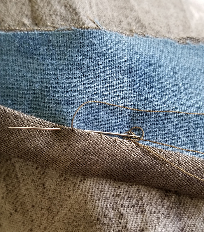
Here’s a peek at the lining, indigo dyed cotton from the Bleachery in Aurura, IL, and the hand finishing stitches on the bias binding. I love me a sweet hand finish. I even found a brown thread in my Gramma’s sewing stuff that’s an exact match for the walnut dyed linen.

close up of a needle and thread stitching a hem of brown linen down over blue cotton.

And these are the earlier versions of the dress. Left, an ecoprinted Woolfork on my 50th birthday. Middle, with a new skimpier bodice more appropriate for the heat of middle age. Right, overprinted with rusty cans and cherry leaves.

a side to side comparison of three different versions of a gray sleeveless dress, modeled by a white woman with long hair and tattoos viewed from the neck down.