two sisters

hand stitched portraits in progress, lying on an ironing board

I’m finally back to working on those stitched portraits I was playing with a while ago, making up a couple of small quilts to test out some processes I’m hoping to use in some bigger work later this year. These two small studies will be part of an upcoming exhibition to accompany a jazz festival at Mackenzie Hall this summer. The larger quilt works that these are serving as practice for will be exhibited in September. I’ve got a lot of quilting to do this spring and summer!

yellow and white fabric pinned together with a stitched drawing of half a face showing

I’m hand stitching the portraits onto a colour blocked background of various naturally dyed cottons and some of the white-on-white brocade I printed recently. These will be composed like formal portraits, and each figure will be holding a potted plant. No conceptual reason for the plant, it’s just an exercise in making stitched plant portraits, again practice for those larger works to come, for which there IS a conceptual reason for the plant. Phew.

a hand stitched portrait in progress, white face with blue hair on a yellow and olive background

Despite the blue hair, this isn’t a self portrait.

dye printing and painting workshop at asil studio

Here is some of our student work from a fun workshop I taught last week along with Lisa Sylvestre at her studio (link: asil). We’ve taught this before but this time we’ve really nailed the tricky business of drawing loads of intense colour out of our dyes, and getting them thick enough to work with easily with no bleeding.

We made extracts from nine different dyestuffs: buckthorn, osage, sappanwood, Himalayan rhubarb, lac, madder, eupatorium with iron added, cutch with soda ash, and cutch with iron. I have some ideas for expanding our palette for next time but just look at what our students achieved with this beautiful range!

These are all a combination of printing (with round felt blocks) and painting with brushes, on cotton bandannas pre-mordanted with gallnut tannin and aluminum sulfate.

natural dyes painted on a cotton bandanna

natural dyes painted on a cotton bandanna

These two above were done by the same person, and I love how one is like chemistry and the other biology.

This one has a lot of nice blending that we weren’t sure would come through the steaming process intact, but it did:

natural dyes painted on a cotton bandanna

We were all very excited at how much of the texture of the original drawing came through in the final product in that central area here:

natural dyes painted on a cotton bandanna

There were a few more we didn’t get photos of, but hopefully I’ll be able to show them to you soon. Spoiler alert: they’re gorgeous.

Lisa made up a few samplers, the first simple blocks of each colour we used, and the second a chart of colour combinations to get a sense of how they might blend:

natural dyes painted on a cotton bandanna

natural dyes painted on a cotton bandanna

There’s still some dye left over, so later this week I’m going to do some screenprinting with it, on plain mordanted fabric and on some that’s already been dyed. Stay tuned! And keep an eye on our class listings at asil.ca if you want to try this yourself; we’ll soon be adding a few more sessions for spring and summer.

this post is cross-posted to my studio weblog (link: levigator press)

blue sketchbook pages 36 & 37

a two page spread in a sketchbook

Red and blue markers.

The verso page was cut out around the drawing of plant forms and glued down onto the previous page, where Sharpie marker bleedthrough from the previous drawing is visible.

The recto page was drawn from a tiny advertisement at the back of an old McCall’s Needlework magazine from the late 60s or early 70s, text “Mrs Virginia Wareheim used her Fabricon Reweaving earnings to help put her two boys through college”. The Fabricon Reweaver was some kind of tool for mending wool fabrics, with two little hooky things for pulling strands back into place. When I was cleaning out my Gramma’s sewing room after she died, I found one of them in a drawer of her sewing machine table. I still have it but have never tried fixing anything with it.

some colours i made in march and april

folded fabrics in a cardboard box

I’ve written about some of these already, but don’t they look lovely all folded together in a box?

This is all of the fabric I’ve dyed in March and April, not including that from the perpetual dyebath, which is still waiting to be washed.

From left to right:

A few olive greens and pale greens (they look kind of whitish here) from exhaust baths of pomegranate and turmeric with iron. Adding iron to the used dyebath initially shifted it to murky olive greens, and dyeing in the exhaust from this produced soft, pale springy greens.

Cutch (reddish) and cutch + iron (olive-brown, a bit purpley looking here).

A few pieces of cotton printed with rusty metal, using the vinegar-salt-oxalic acid method and left bundled in a basin for a few days.

Indigo, loads and loads of indigo. This is about half of the indigo fabric I’ve made recently; the rest of it is still waiting to be neutralised and washed.

Everything to the right of the indigo is pomegranate and turmeric: a straight 50/50 mix for the yellow, then a series of reheating the exhaust with iron to produce swampy dark olives, acidic lighter yellowy olives, and some lighter soft greens. There’s a mix of cottons and linens here, all reclaimed fabrics, destined either for clothes or quilts, and a stack of (new) cotton bandannas over at the right of the frame, which I’ll probably piece together into a dress.

back to colour

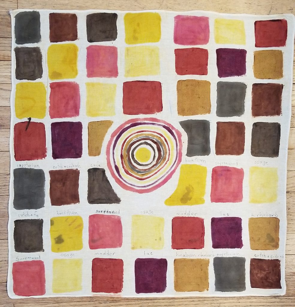
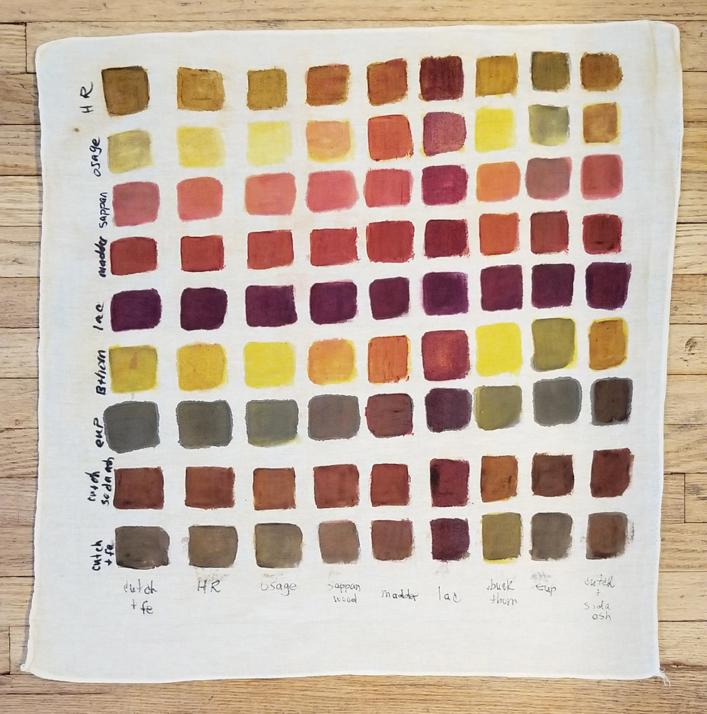
Recent experiments in the dye studio!

folded fabrics in shades of brick orange and greenish brown

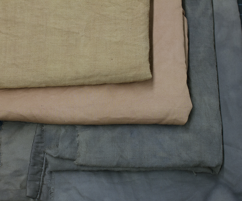
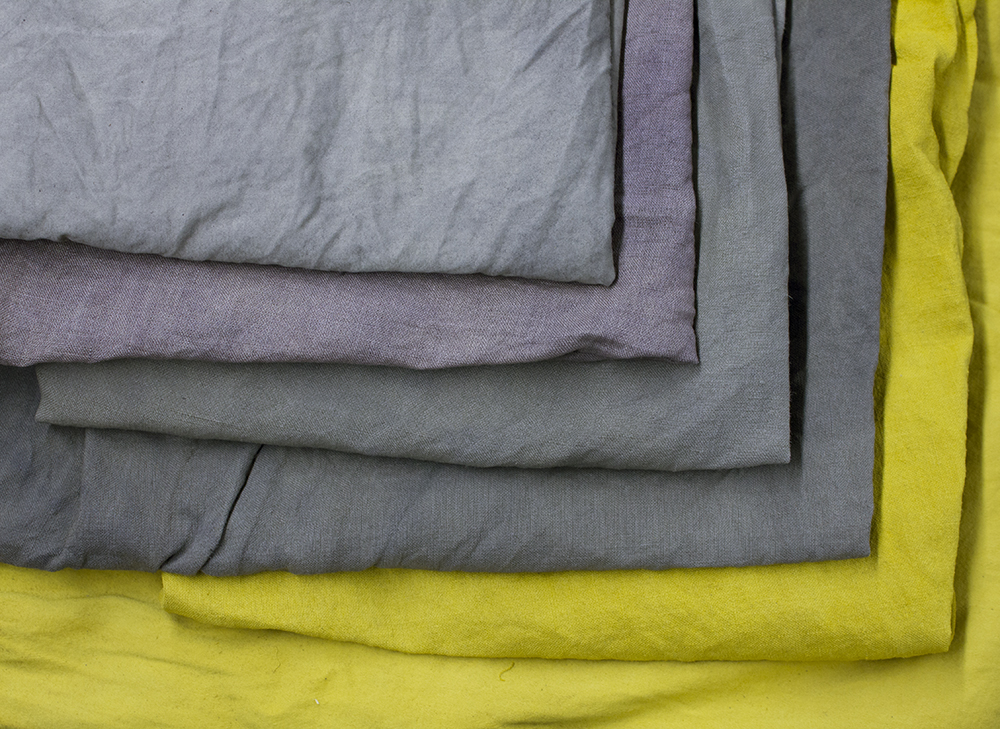
This is a cutch dyebath I recently made with Lisa of asil (link: asil.ca). We split the dye into two vats and added iron to one of them hoping for a good range of browns. The result from the straight cutch was predictable, a range of reddish brick tones (seen on cotton and linen in the above photo). The iron vat didn’t give the same warm chocolatey brown shade I achieved last year, when I dyed a piece of linen to make my partner some brown pants. Instead we got this almost charcoal gray brown drab, the result of going too heavy on the iron. I’m pretty much a master at this point of going too heavy on the iron, if this kind of clumsiness were the sort of thing over which one could claim mastery. You can see the too-iron-rich brown on both cotton and linen above.

fabric floating in deep yellow dye in a steel pot

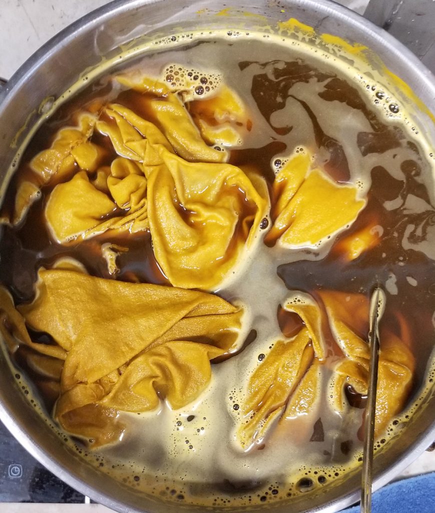
I’ve been having lots of success with this brew lately, and have finally hit upon an easy and abundant source of the swampy olive tones I so crave. This is a 50/50 vat of ground pomegranate skins and turmeric. I read about adding pomegranate to turmeric to improve its lightfastness in the guide to natural dyes published by Maiwa, a great resource and the place where Lisa and I buy a lot of our dyes (link: MAIWA). They didn’t mention proportions so half and half is what I’m trying. This vat just keeps on giving, exhaust after exhaust, and the colour is just WOW.

After the first load of glorious gold fabric came out, I reheated the exhaust dye and threw in this collection of cotton yarns, which all started out either white or very pale gray and had been gunked up with a myrobalan tannin in the mordanting process and a dip in iron water to produce dirty gray tones.

skeins of undyed cotton yarn in shades of yellow and gray

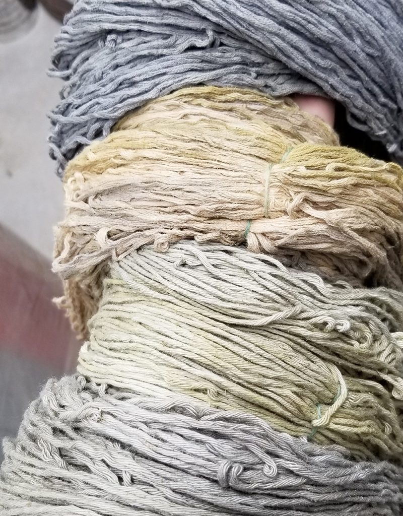
As I had hoped, the iron present in the yarns permeated the dye vat and shifted the whole thing to a murky olive green.

fabric floating in olive green dye in a steel pot

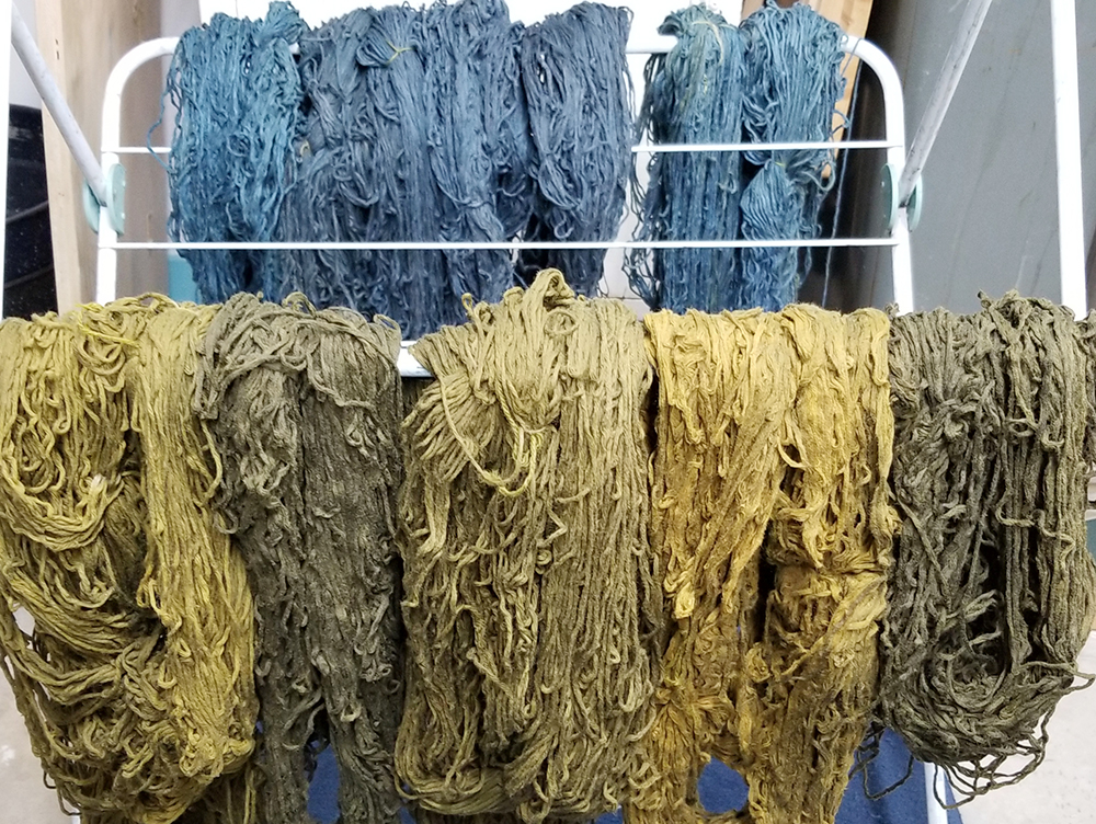
The resulting yarns, due to the variations in their iron content, came out a lovely range of the swampiest greens I’ve yet achieved. Here you can see them drying along with a set of the same yarns, pre-dirtied in the same manner and then dyed with indigo. This will probably be the bulk of my summer knitting as there’s enough yarn here for three warm weather sweaters.

skeins of olive green and indigo yarns hanging on a drying rack

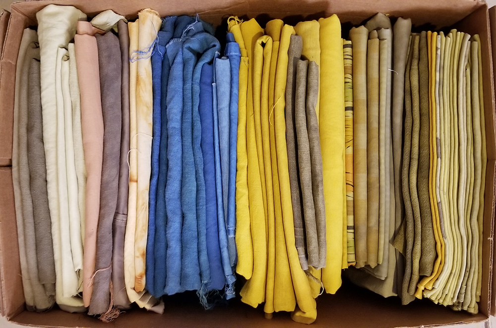
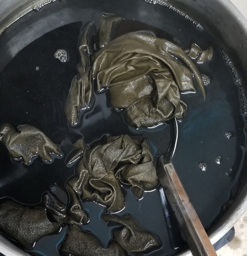
After the yarn came out of the dyebath it looked like there was still a fair amount of colour, so I heated it up again (exhaust #2 now) and dyed another load of fabric. Here are the resulting fabrics together in the rack:

gold and brown fabrics hanging in a drying rack

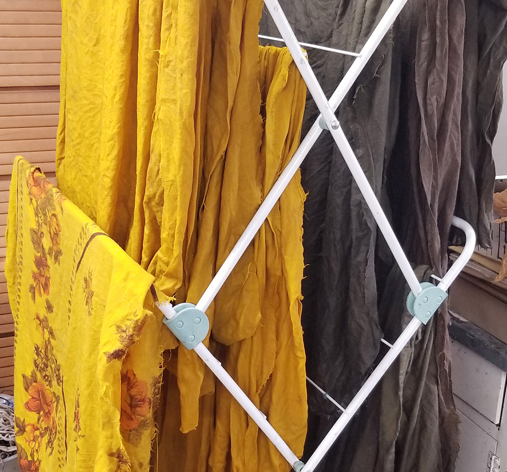
And the fabrics after drying, but before their final wash (which I try to put off for a couple of weeks if I’m not in too huge a rush to sew something). From the top, with iron on cotton, on handkerchief weight linen that had previously been dyed very lightly with madder root (red), two pieces of secondhand linen duvet cover that started out oatmeal colour, and the unadulterated turmeric-pomegranate gold on the same duvet linen, and on cotton bedsheet.

pomturm

I’ve since done a second round of this same dye bath and managed to get loads and loads of weird acid greens and paler sludgy olives. Pictures soon!

white noise in a white room

a carved linoleum block sitting next to a graphite rubbing of the block on paper, with carving tools scattered around

Here’s something fun I’ve been working on recently. It’s a lino block of one repeat of a brocade pattern for printing on fabric.

I needed some white on white, or nearly white, brocade fabric for a quilt series I’m working on (for an exhibition in September, more on that later). It’s not the exact pattern but it meant to represent the white brocade wallpaper in my maternal grandmother’s living room. This particular pattern is taken from a certain style of gold brocade drapes from the 1970s that must have been everywhere, based on the sheer volume of them my partner and I used to find in thrift stores in the 90s. Those were our Society of Creative Anachronism years, and I still have my glorious Russian shuba (full length overcoat with “fur” trim) made from this, as well as a beautiful but unfinished court sarafan hanging in my closet. My ulterior motive for using this pattern for my quilt project is that I will be able to print other fabrics with the block later on, in particular a set of old fashioned pinch-pleated drapes for our bedroom.

For now, though, I’m printing it in white on a variety of not-white fabrics, mostly thrifted cotton bedsheets, that I’ve made not-white by boiling in coffee (the absolute easiest and best smelling way to make white just a little less white) and a more grayish not-white by adding tea and a bit of ferrous sulfate to the coffee.

a brocade pattern printed in white ink on off-white fabric

This was my first attempt, with janky registration and a hole in the fabric that I printed right over, and yes, this piece will probably end up in a quilt, hole and all. I’m not at all worried about the registration for this project, although I’m quickly getting the hang of getting the block lined up. There are things I could have done in the planning stages to make registration easier, but oh well. I’m kind of a messy printer at the best of times.

I didn’t do anything to clear out the chatter on the block, and I’m pretty happy with how it fills up the space between motifs in the fabric. Accidental marks are so often the best kind of marks, in printmaking.

Here it is printed on the pale gray where the contrast is actually enough to be able to make it out on screen. The paler fabric is visible on the right, a level down in the drying rack.

pale gray and white brocade fabric lying on a steel drying rack